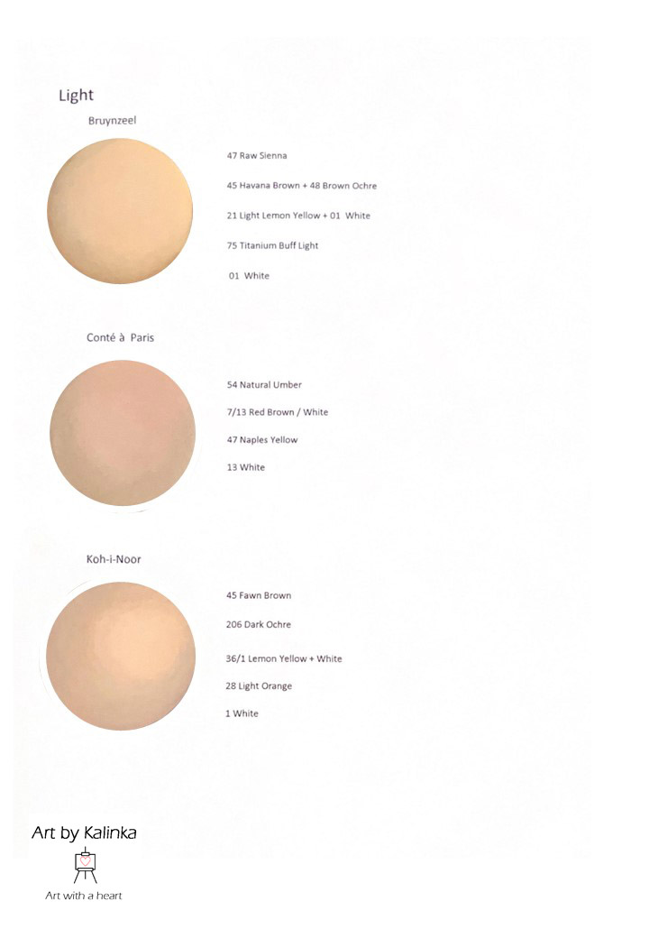
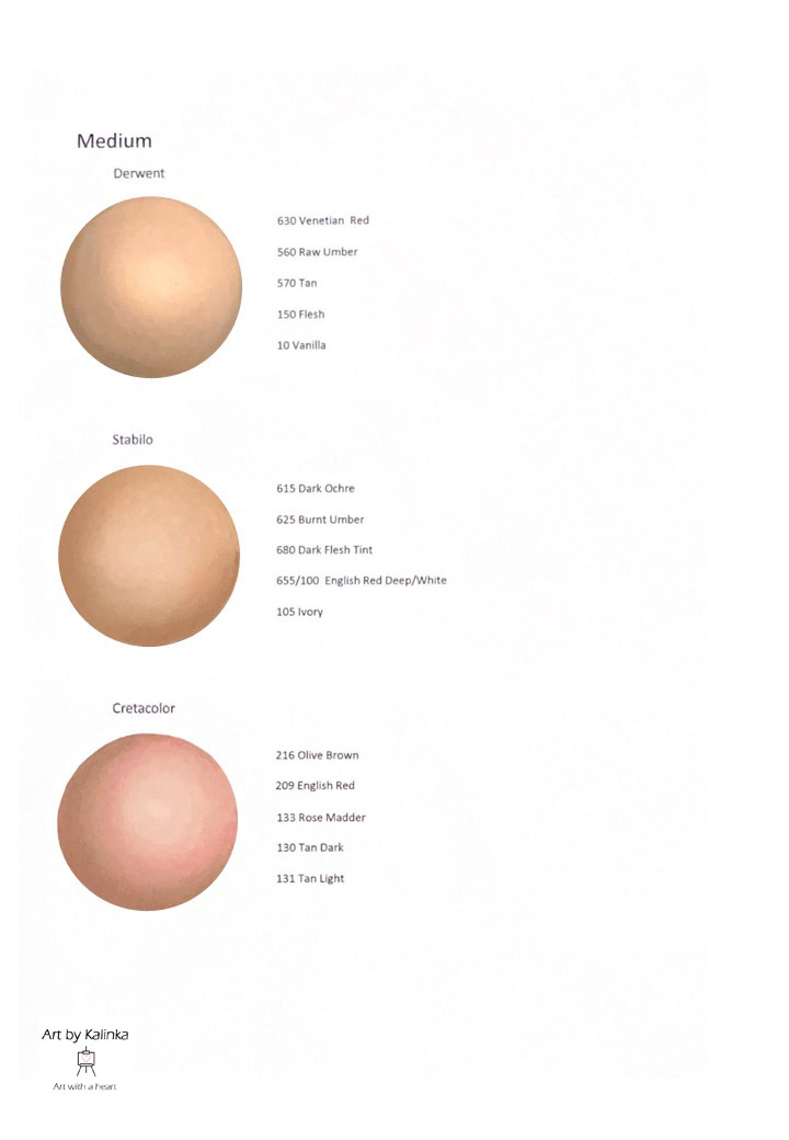
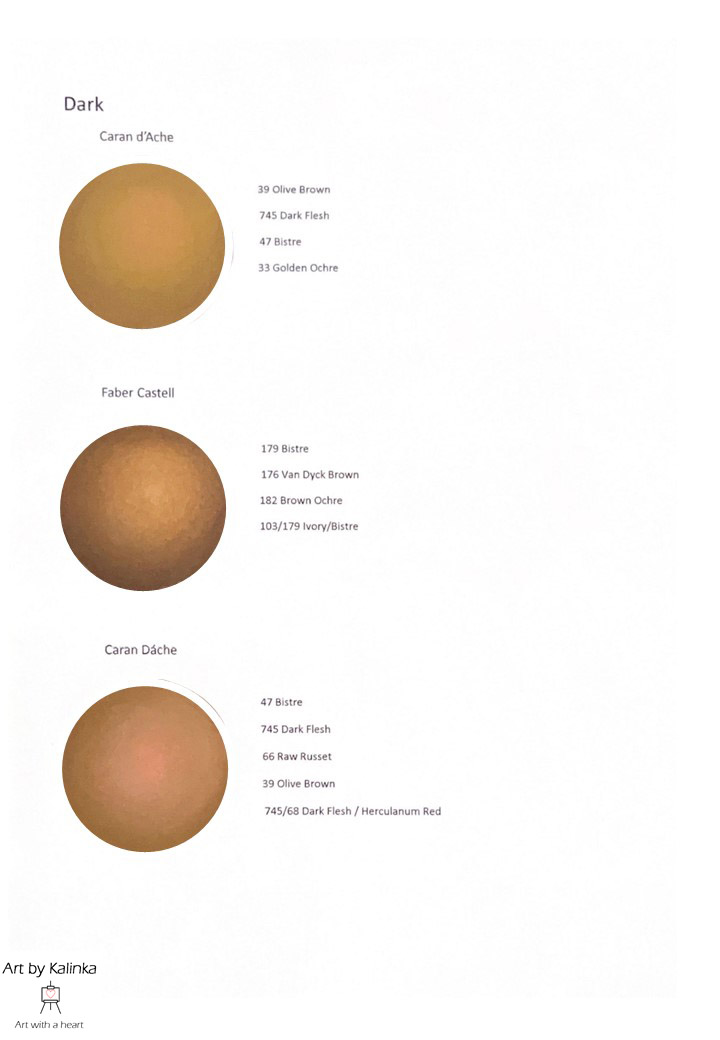
Many artists struggle with achieving skin tones. Without pretending I know it all, I wanted to share my technique for creating realistic skin tone using pastel pencils. Below you find 3 variations on light, medium and dark skin each. These variations are based upon cold, neutral or warm tones of the skin and the colors I use to achieve that. I’ve created these examples using various brands and I give the color numbers and/or names of these colors for you to reproduce these skin tones.
How to interpret the examples
Below you find the warm, neutral and cool variations on the 3 skin tone groups Light, Medium, Dark.
Every example is made with colors from a certain brand and on the right of every example you find the used colors of that brand.
The order in which I give the colors, is also the order in which I’ve created the examples.
You can click on the images to enlarge them


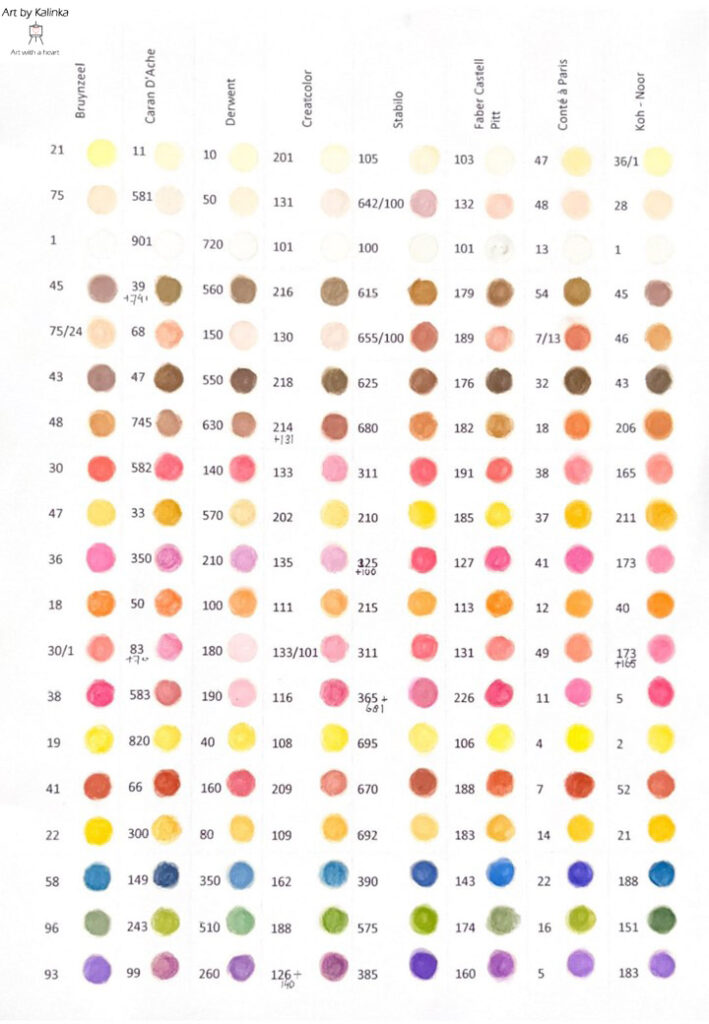
Comparing colors from other brands

As you have seen in the examples above, every brand contains colors that help you achieve realistic skin tones and shading.
To help you along, I’ve created a comparison swatch with the same brands, so when the example is made with Brand A, you can find the similar colors for Brand B to achieve a similar skin tone.
In my download section I also offer both the example pages as this comparison swatch as a blank stencil for you to create and/or practice your own skin tones, using your own brands, or trying Brand B where I gave an example of Brand A (and vice versa).
